What Makes the Best Dental Logo? 13 Traits of Great Dental Logo Design

Updated March 31, 2026
Originally published December 3, 2020
Knowing what makes the best dental logo design is far from an exact science. There are many ways to create an impactful, memorable logo that stands out from the crowd.
Key Takeaways
- Know your target audience before designing. The best dental logos are built around buyer personas, not personal preference.
- Simple, clean designs outperform busy ones. If it loses impact when scaled down or printed in one color, it needs more work.
- Typography, graphic, and color must all work together. Mismatched elements undermine the entire logo.
- Avoid chasing trends. A timeless logo serves your practice for decades.
- Research competitor logos in your market first. Standing out locally matters more than standing out globally.
- Legibility is non-negotiable. Name and differentiator should register immediately at any size.
- Your logo must be relevant to dentistry and your brand's vision. A stunning design that does not connect to your practice is a missed opportunity.
In the dental industry, having an awesome logo is essential.
Your logo can be one of the most important tools you will use to attract new patients.
Most dentists create a dental logo as part of their dental branding efforts when buying or starting a practice.
Others redesign their logo during the rebranding of their dental office, using essential dental branding strategies to enhance their image and attract patients.
In this blog post, we'll discuss 13 qualities that the best dental logos exhibit. Not only that, but at the end of the post, we'll provide you with seven different logo examples, as well as editable dental logo templates, meaning that you can download these templates and edit the logo to have your practice name, or alter the colors or the design slightly. Completely free.
A great logo doesn't happen by accident. These dental logo design ideas and examples show the principles the best ones have in common.
1. The Best Dental Logo Design Starts with Strategy
First off, it goes without saying that a professional dental logo is better for creating name and brand recognition than simply throwing something together.
Your dental logo should speak to your target audience, so take the time to identify them before you design it.
The best dental logos integrate brand identity through professional graphic design informed by discussions with your office, market research, and a clear understanding of the image your practice is trying to or has built.
So, how do you identify your target audience? By creating buyer personas, as discussed in this recent blog post, you can effectively market dental implants to those who are actively seeking them.
Buyer personas are detailed profiles of the kind of people you want to attract to your dental office. You should be able to answer questions like:
- Why does this audience want to go to the dentist (healthy mouth, beautiful smile, oral pain, tooth replacement, etc.)?
- What’s keeping them from going to the dentist (price, lack of knowledge, inconvenience)?
- How can I appeal to this audience’s interests?
Once you have detailed buyer personas, you can use them to brainstorm your logo design. How can you integrate their interests, expectations, or even pain point solutions into your logo? Use this information to develop a tagline that really resonates with them.
2. A Strong Practice Name and Dental Logo Work Together
Previously, I wrote about how you can choose the best name for your dental practice. That advice comes full circle when creating a logo for your dental practice, since your name will be part of it.
Your dental practice name should be meaningful to your target audience, positive, and legally available to you, among other elements. If you haven’t honed in on a name for your practice yet, follow the advice I offer on naming your business in this post:
Read our blog post: Dental Office Names: How to Name Your Dental Practice
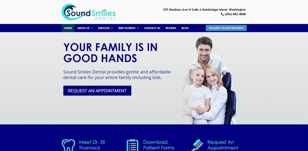
Your practice name and logo are often two pieces of the same puzzle, so they need to work together. Take a look at the logo we designed for Sound Smiles Dental as a sample of a dental clinic logo. This dental practice is located in Puget Sound, Washington, and named their practice to reflect this.
Then, we were able to integrate the message into the logo design by using sea waves:
3. Simple Dental Logo Design Makes the Most Impact
A simple logo design is almost always the most effective in speaking to and invoking emotions with your potential patients. A clean, simple design can also have the greatest impact. The most famous example of a simple logo design is the Nike logo. There’s no text, just a symbol that evokes speed and precision, which the Nike brand is all about.
Your dental practice isn’t one of the most memorable brands in the world, like Nike, so you may not want to go quite that simple. But you can still use the concept to make sure you don’t try to pack too many elements of logo design into it.
It’s important to remember that your logo will be used in a variety of ways. Having too many elements, the fine details will get lost.
From an outdoor sign to a dental office brochure, you will use your logo in more ways than you anticipate.
If you’ve already come up with a rather busy logo concept, try paring it down to the essentials. Eliminate elements of logo design that aren’t essential to your core idea. You might find that’s enough to convey your brand message.
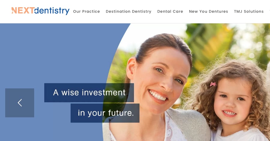
This NEXTdentistry logo is a great example of a simple logo design:
4. A Memorable Dental Logo Stands Out from Competitors
If you want your dental office logo to be effective, people should be able to remember it after a glance. In most cases, that’s all the attention your logo will receive from people.
One way to do this is to use unique artistic elements or styles that symbolize your name or specialty. A stylized tooth is the most common example, but try to branch out. If you offer emergency dental services, a red emergency cross may be appropriate. If your unique selling proposition is no-wait dentistry, then you could include a clock.
Test out your logo design with friends and family to see how memorable it really is. Ask people who’ve never seen it before to glance at it. Can they describe the basic elements afterwards?
Another strategy you could use is putting your logo on a piece of paper with several other logos. Show the paper to someone for at least 15 seconds. After, take the paper away and ask them to recall as much as they can about the logos. Were elements of your logo part of what they described?
Some dental clinic logos are overly complex, making it difficult for viewers to grasp the concept fully. Instead of putting more effort into looking at it, many will just dismiss your logo, which you don’t want them to do. Yes, you want your logo to stand out from the competition, but that doesn't mean that it has to be complex. Clean and simple designs are often the best approach for dental logos.
5. Every Element of Your Dental Logo Must Work Together
All your logo elements must be relevant to your target audience. But do all these pieces work well together?
An integrated logo will have all the different elements of logo design working together to convey a message. The most common disconnect you see in a logo is between the typeface and the graphic. If the graphic is clean and linear, then a curvy, complex typeface would clash.
An integrated logo will also complement whatever materials it appears on, whether it be your website, newsletters, or other media. A good dental clinic logo sample is Murdock & Searle Family Dentistry:
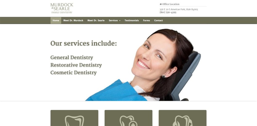
The logo is simple but integrates well with the color scheme and overall site feel.
6. A Great Dental Logo Works Across Every Medium
Your logo may look great on your newsletter, but what about other mediums it might appear in? If you work with a professional logo designer, they will likely design it as a vector graphic so that you can use it in any size or format.
To test out the versatility of your logo, print it and view it in:
- multi-color
- one color
- reverse color
- black and white
Imagine how it would look on t-shirts, hats, pens, keychains, and other materials. Imagine it was the size of a billboard or a postage stamp. Would it still convey your message?
Color is often the biggest determining factor of versatility. You might start the design process in black and white to focus on shape and concept. Then add and change the colors later.
Colors will also affect the cost to print and use your logo. In general, more color means it's more expensive to print. When printing your logo for commercial purposes, using CMYK, RGB, or Pantone systems will all affect the cost. So, familiarize yourself with the printing process before you settle on a color decision.
7. Your Dental Logo Should Match Your Target Audience
This dental logo design element goes back to speaking to your target audience again. Make sure your design is appropriate for the kind of people you want to attract to your practice.
For example, using a child-like font would make sense if you specialize in child dentistry. If you specialize in dentures or implants, your font or design should speak to an older audience.
Kuhio Pediatric Dental’s logo is a great example of an “appropriate” logo. It uses two playful fish for the logo design to reflect the practice’s location (Kauai) and its target audience (children).

8. Timeless Dental Logos Outlast Trends
One mistake many businesses make with their logo design is following the latest trends in color or design. This will definitely make your logo look fresh for a while. But here’s a lesson from the fashion industry:
After fresh comes trendy, and after trendy comes common. After common, all you have left is tacky.
Unless you plan to redesign your logo every few years, leave trends to the fashion industry. Instead, try to create something timeless.
Don’t get me wrong, your logo should definitely have a modern feel. But being contemporary doesn’t necessarily mean including trendy components.
Turn to popular logos that have changed very little over the years for inspiration. Some popular examples include UPS, the London Underground signs, and Starbucks.
9. Your Dental Logo Needs to Stand Out in Your Local Market
Just like any industry, dentistry logos often have common elements of logo design. Even if your logo checks off every other point on this elements list, if it's not unique, it won’t serve your business purposes.
Before designing your logo, take a look at the logo designs of other dental practices in your town. You’ll want to stand out from them.
What are the best colors for a dental logo? Well, far be it from me to say what is 'best' for you, but consider that blue is a calming color, which is why many healthcare and dental practices use it in their logos. But if too many other dental practices in your area had the same idea, then your logo won’t stand out.
Using a tooth for a dental logo is one of the biggest clichés in the logo design industry (not just dentistry). At the same time, it is what most dentists choose.
Remember, your logo needs to be seen as trustworthy. Don’t design something so outlandish that it scares potential patients away.
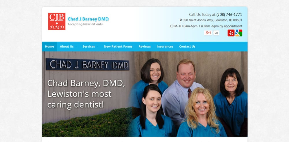
Chad J. Barney DMD’s logo is one we designed that really didn’t follow what you’d traditionally expect from a dental logo. But it was still impactful, stood out from others, and served its purpose:
10. Good Dental Logo Design Uses Proportion and Balance
Most people might not know much about symmetry, but subconsciously, it affects how they perceive a logo. A promotional logo uses symmetry to create a balanced and ultimately pleasing aesthetic.
A good example of symmetry in action is the famous Apple logo. It nearly follows the Fibonacci sequence and the golden ratio:
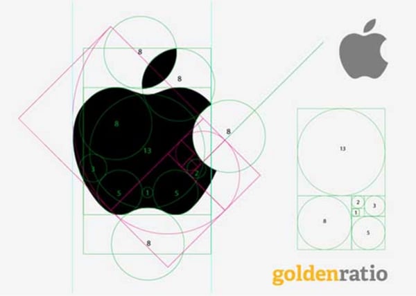
That said, you don’t necessarily have to follow a mathematical principle with your logo design. Apple didn’t; it just worked out by chance.
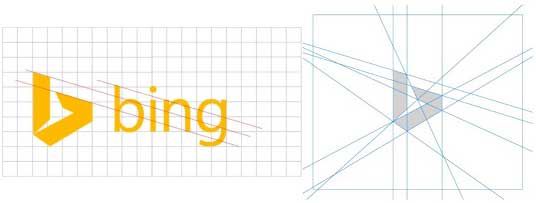
But it is advisable to start with a design grid. Bing did that in their logo redesign to make sure they used the same angles to be consistent with Microsoft’s other product logos:
11. Legibility Is Non-Negotiable in Dental Logo Design
A logo design can look great on your computer screen, but it needs to be legible in every context it’s seen, including on your building, in newsletters, and in advertisements. Apply the 3-second rule. People should be able to know your practice's name and what sets you apart from your competitors in 3 seconds. Imagine how your logo will look on your building to people driving by. Will they be able to read the letters and recognize the art?
You may want to play around with placing the type on the art vs. below. If the design is still recognizable with the business name overlay, that may be your best option for legibility.
12. Consistency Across Every Medium Builds Brand Recognition
If you want your logo to really speak to your brand and be memorable, then consistency is key. Make sure your logo looks consistently the same when it appears online, on billboards, company vehicles, uniforms, and other mediums.
If you find yourself making changes to your logo design to work on different mediums, make those changes for all mediums. Don’t resize the font, move things around, or tweak the colors. Keep the visual presentation consistent.
You always have the option to add elements to your logo’s message when using it on different mediums, as long as they match the logo color and theme. Take a look at this Kennewick Dental clinic logo sample:

It appears on their homepage in two places, and the logo is consistent. When we created this for them, we added a tagline, “Tailor Made Smiles is now,” to educate the site visitors of the new practice name.
13. Your Dental Logo Must Be Relevant to Your Practice and Patients
I’ve seen so many flashy, impressive logo designs out there that catch attention and are definitely memorable. But they all share the same problem:
They have nothing specific to do with the marketplace they service.
A relevant logo will align with your industry and your brand's vision. If you’re working with a creative team to design a logo for you, this is your job to communicate. Make sure the designer has a deep understanding of your company, mission, and target audience to create the right logo.
The more detailed your creative brief, the better. Most designers will be happy to use this information to serve the most relevant logo design possible.
Dental Logo Samples & Free Templates
Having the right logo for your dental practice can help give your business a unique look. A creative logo can go a long way to leaving a memorable impression on potential customers.
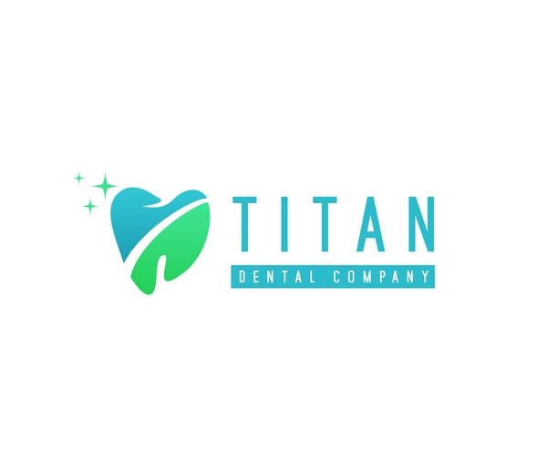
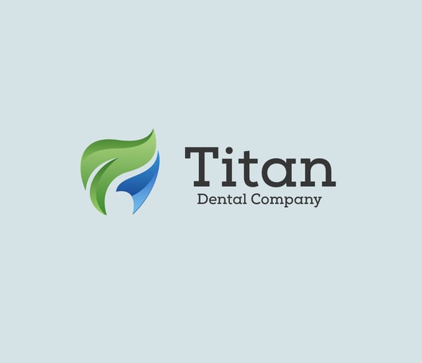
Take a look at some of these sample dental logos that we created specifically for you.
You can download these logos by entering your information on the slide-in that appeared on the right-hand side of the screen. Enter your info, and we will send you the templates. These templates allow you to edit them yourself. We even include the source files, which allow them to be edited (change colors, adjust the logo, etc.).
Dental Clinic Logo Samples (Digital)
Dental Office Logo Samples (Business Cards & Print)
Frequently Asked Questions about Dental Logos
What makes a good dental logo?
Simple, clean, and readable at any size. Your logo needs to work everywhere—website header, business cards, yard signs, embroidered shirts. Test it in black and white. If it falls apart without color or gets muddy when scaled down, it's not done. And make sure it actually fits your practice. A high-end cosmetic office shouldn't look like it does balloon animals.
Should a dental logo include a tooth?
You don't have to. Tooth icons are everywhere, which means most of them look exactly the same. If you're using a tooth, it better be stylized enough to stand out, or you're just adding to the noise. Plenty of strong dental brands skip the tooth entirely and use a wordmark or abstract symbol instead. Your goal is to be memorable, not obvious.
What colors work best for dental logos?
Blue and teal dominate dental branding because they signal trust and cleanliness. They also make you look like everyone else. If you go that route, your design and typography need to be strong enough to differentiate you. Whatever colors you pick, make sure they maintain contrast on screens and still work in one color for print and embroidery. Choose colors that match your brand, not what's trendy.
Should I trademark my dental logo?
If you're planning to build a real brand and stick with it long-term, yes. Trademarking protects your logo and name from copycats, especially if you're expanding or investing heavily in marketing. Before you file, make sure your logo is actually original and not built from stock graphics, and do a search to confirm no one else is using something similar. Work with a trademark attorney to do it right.
What file types do I need from a designer?
Vector files (AI or EPS) for print and signage, SVG for web, PNG with transparency in multiple sizes, and JPG for basic use. You also need color and black-and-white versions, plus horizontal and stacked layouts. If your designer only gives you PNGs, you'll run into problems when you need signage, embroidery, or professional printing.
How much should a dental logo cost?
Depends on what you're getting. A $50 logo from a template site gives you exactly that—a template. A real logo includes strategy, research, multiple concepts, revisions, and a full file package for every use case. The price matters less than whether the logo is actually unique, works everywhere you need it, and comes with the right files. Titan Web Agency charges $1199 for a logo, and $1999 for a logo + style guide (the style guide provides the official color codes, fonts, instructions on how the logo should be used, as well as business card design, letterhead, etc. An example of Titan Web Agency's style guide.
Conclusion
Should you create your own logo or hire a professional logo designer? That's your call, but consider that you'll likely have one or two logos over your lifetime. Investing in a professional who is proficient in graphic design and can effectively portray your brand identity through your logo will likely yield better results in the long run than using logo templates and a DIY program.
Remember, your logo isn't for you! It's great if you like it, but we always recommend settling on a few different dental practice logos and then using friends, family, social networking, or user testing to get a feel for what others think is the best dental logo.
Need advice or help with an effective logo design for your dental practice? Contact us today, perhaps we'll be able to bring your dental practice logo ideas to life.
Ready to take your dental practice to the next level?
Schedule a FREE dental marketing consultation!
Book a consultation now. No pressure, no selling, just a consultation with somebody who's been in dental marketing for nearly 15 years and knows what works.
Tyson Downs is the founder of Titan Web Agency, a company specializing in marketing for dental professionals. With an impressive track record of working with over 100 dental practices, Tyson has a deep understanding of the unique marketing needs within the dental industry.




.png)
.png)


